


The forecast is clear:
2024 is a year of COLOUR, GOOD VIBES AND FUN.
It’s the most exciting time of the year for any followers of décor or fashion. Trends and colours have been chosen and we wait to see how our suppliers will respond to the challenge. We are not disappointed. Our suppliers have updated their mood boards and plans are underway to make these colours available to our clients in the upcoming year.
It is wonderful to see the return of earth colours with the inclusion of newly introduced hues of Gingerbread and Pesto. But our supplier, Fermob has not stopped there, they have embraced the Pantone 2024 colour trend and added to their pastel, ice cream colour palette. This works so well with their current Frosted Lemon and Ice Mint combo and can be boosted by introducing the Pantone Colour of the Year, Peach Fuzz.

COLOUR, COLOUR, COLOUR
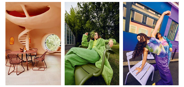
Play with orange, captivating red, earthy muted greens, rich earth tones and playful purples. This is the time to mix traditional pieces with modern asthetics and colour palettes. Bring nature into your design to enhance inner balance and well being.
When incorporating trend colours gather a few good statement pieces: scatter cushions, a rug and a few colourful side tables and add them to your existing décor. All 2024 trending colours will blend well with a neutral grey, taupe or beige background.
Avoid over saturating your space with colour, especially with strong colours like red, burnt orange, mustard etc. Choose a few trending accent colours you really like and add them to a neutral space to achieve a balance between calm and vibrancy. Add texture and natural greenery to the space to create interest and a tactile experience.
Tone-On-Tone - The Chic Trend
2024 does not exclude those who are not attracted to bright colours and vibrant accents.
If you prefer a more restrained experience, 2024 trends also include tone-on-tone layering. Using one family of colour (see example below) you can create a calm, elegant space. The “We belong together” colour palette uses different tones of Taupe creating a calm and elegant colour palette. Use colours for funiture, paint, scatter cushions, throws, lighting, carpets and accessories.

But a tone-on-tone space is not without its challenges. This look can become one dimensional and boring without the incorporation of texture and patterns, gloss and matt, dark and light, wood and metal.
The hardest part is to reach this perfect balance whilst still showing restraint. If you have the flair for this elegant décor style then don’t be afraid to let your talent shine.
Don’t just restrict yourself to neutrals like Taupe, Grey and White for your tone-on-tone experience. Try the latest trend and go for tones of Blue on Blue, or Green on Green. These tones work so well in an outdoor setting reflecting the natural greenery of the garden and the blue reflecting the tones of your swimming pool. Add depth with warm tones and lightness with cooler tones.
The Beauty of Earth Tones
We are very excited with the return of Earth Tones, creams, browns, tans and muted green tones. This palette creates warmth and cosiness and allows for accents of wood and leather. This palette is great to use with your garden as the backdrop. Earth tones blend seamlessly into an existing Grey décor scheme for an energising effect. Add pops of white to lighten, highlight and keep things fresh and airy. If you have a love of all things mid-century modern then this colour palette will bring you joy. Let us introduce you to Fermob's tantalising new earth colours.


It’s Time To Teak
Inspired by the 2024 Earth Tone trend, we are taking a closer look at Teak. What better accessory to add to these wonderful tones than raw, untreated teak? One cannot contemplate purchasing Teak without being aware of our social responsibility when it comes to making such a purchase.
Find out from your furniture dealer if their wooden products are harvested in a plantation watched closely by the Forestry Stewardship Council® who enforce high standards of sustainable forestry.
Using Teak as the base, we show you how to incorporate Pesto and Gingerbread into your 2024 look.


Pastels
Pastels are great accent colours and add lightness to your décor all year round. They remind us of Easter Eggs, iced cupcakes, spring flowers and Beatrix Potter's bunny rabbits. They are peaceful and calming because they are less than their saturated cousins. Frosted Lemons saturated cousin in Yellow, it’s been toned down, softened with white to act as a tint of the original colour. Marshmallow is softened from Purple, making it whimsical and romantic. Pastels pair beautifully with White, Grey and Beige, so walk on the soft side in 2024.

Over the past couple of years a lot of emphasis has been put on the patio and 2024 will be no different. People have learnt the importance of having an outdoor space to enjoy, away from the confines of walls and in the fresh air.
Whether your patio is large or small makes no difference when maximising the space you have available and bringing the comforts of the indoors, out. Establish what your “good vibe” is and what colours appeal to you most, go ahead and create that oasis to recharge your batteries, entertain your friends, and be inspired.
We have offered you four trending palettes to work with in 2024, Earth Tones, bright vibrant colours, the classic tone on tone scheme, and romantic pastels. Whichever style you choose, have fun with it, let it reflect who you are and what down-time and family time means to you.
We are here for you, to share the journey, and inspire.
The Bryanston Team: Katya, Milena, Sneja
The Cape Town Team: Beryl and Wilma